In the previous post, I explained all the necessary details, from business impact to performance metric, etc. We ended the post by uploading all the libraries.
Time to upload the data into our system. We will use pandas read.csv function and some other functions like info and shape to get some insights into various details about the dataset.
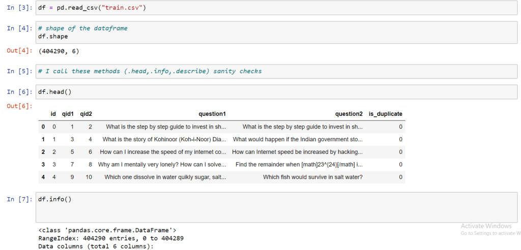

All these functions that I have used are used by everyone at the starting of the Analysis. These are simple functions, so shape function tells us about the number of rows and columns in the dataset. An “info” function tell us about the data types and null values if there are any (when the values don’t match in terms of numbers) then you can surmise it may have missing “NULL” values. Details about the size of the file and its usage can also be found through this function.
As I told you a brief about the features of our dataset, id represents the index, qid1,qid1 represent actual question id’s that we got from the data from quora. And question1 and question2 feature are the features that contain the description of the questions that are to be compared. The dependent variable of our data set is is_duplicate which contains only two values either “1” or “0”.
Let us further analyze our dependent variable is_duplicate.

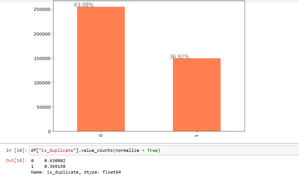
Before I explain the code of the plot. Let me explain to you first why I chose to analyze is_duplicate. As we know is_duplicate is our dependent variable and it is an important variable in our dataset it decides everything. It is like the wife in a relationship. Dependent variable gives us the first-hand view whether data is imbalance or not. What do I mean by data imbalance? Data imbalance means that there should an almost equitable distribution of classes if the dependent variable is categorical. For example, if your data has 4000 observations and your dependent variable is categorical with two classes “yes” and “no” then you should have at least 1000 – 2000 observation of one class and rest of the other class. If the percentage is extremely less then data will be considered as imbalanced. This is an important insight that furthers our analysis in right direction.
The plot that I put forth to show the percentage distribution of the class labels is a bar plot. The bar plot shows the categories and their count. x- axis will represent the distinct classes of the categorical variable and y -axis will show either count or percentage on how many times the class is represented in the total observations.
Our data is a balance dataset as it has decent distribution between the classes.
As far as explaining the python code is concerned, I have done that in the ipython notebook which you can download from my git-hub account. Explaining here will make the process boring. Here I am most concerned about sharing the approach.
A normal Analysis can take different shapes and forms. It is up to an individual how he has in a way I am trying to say this is the approach one must follow but usually people start by analyzing different variables in the data. The term that represent such an analysis is Exploratory data analysis.
Exploratory data analysis loosely represents the idea of cleaning the data, summary statistics etc. But exploratory data analysis is much more than this it is in true sense the art of exploring the terrains of the data which will advance you in the direction of data enlightenment well, not exactly but surely in the direction of your solution.
Uni variate Analysis means a single variable study. Here each variable is studied alone.
Bi variate Analysis means two variables are studied together. sometimes in relation with the dependent variable also.
Multivariate Analysis means more than two variable are studied together.
In the next code snippet I had done some of this analysis with the variable of our dataset.
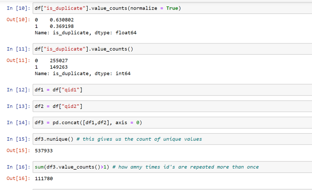
I have explored qid1 and qid2 variables which represent distinct question id’s. with pandas nunique function I was able to see how many unique question ids do we have. Then I compared it with how many question id’s that are represented more than once with pandas value_counts() function. The idea was to track down all the unique question ids. See qid1 and qid2 have values in odds and even numbers respectively.
we wanted to check if there were a duplication of these ids in any way, as it turns out, there were no duplicates.
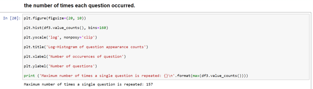

Now what is this chart represent. First of all about X – axis and Y – axis. On X-axis we have shown the number of Now, what is this chart represent? First of all about X – axis and Y – axis. On X-axis we have shown the number of occurrences of question id. Y-axis represents the count and we have used the log scale. Since the number of rows in our dataset is close to 4 lac. To get the right representation we modified the scale to log scale. 10^0 means 1. There is one question that is repeated 157 times. we also got this from the value counts function and there was one which repeated 121 times. If we further analyze qid1 == 2559 is repeated 157 times ” what are the best ways to lose weight.” and qdi2 is different.
There no duplicate pairs as we have seen.
Checking and imputing missing values.
Next, We will check Missing values if there is any?

This pretty much the general analysis as far the cleaning and insights are concerned. There are so such discrepancies in the data.
Next we will see feature extraction and feature engineering.
